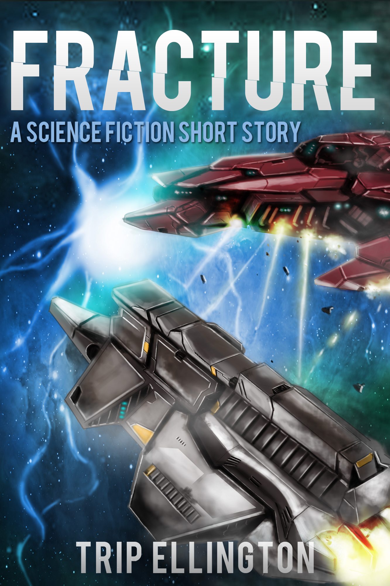
I like to perform all sorts of tweaks and experiments to see what gets better results. My first cover for Fracture was made very quickly and I wasn't completely happy with how the ship stood out. It also didn't highlight the fact that there is a very awesome space battle in it as well. So, in an effort to make it as easy as possible for the reader to know what a story is about, the cover now looks like this:

Much better, don't you think? The colors are brighter, the ships are engaged in battle, and best of all, space debris! Let me know what you think by commenting below. The changes should update on Amazon within the next day or so.
